
For a florist, your logo is the essence of your brand. Perfecting a floral logo that communicates all of the important parts of your floral business can seem like a daunting task. Here are some logo designs for inspiration and tips to keep in mind when designing a company logo.
5 Floral Logo Design Types
The first place to start when making a floral logo is the design. There are a plethora of different design types to choose from. The main design styles of floral logos are Abstract Mark, Emblem Mark, Lettermark, Wordmark, and Combination Mark. Each type comes with its unique advantage that can help you to differentiate your brand from competitors.
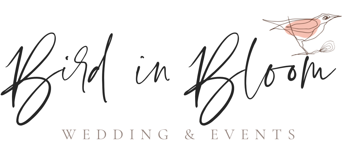
1. Combination Floral Logo
Combination logo via Floranext
![]()
Combination logo via Floranext

Combination logo via Third Bloom
Space
A Combination mark is a perfect solution to tie together a brand name and image. This type of logo creates a clear message to the consumer as to the name of your brand as well as a graphic to associate it to. This type of logo is perhaps the most popular among floral businesses and allows you to showcase your brand and personality.
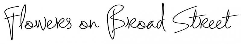
2. Wordmark Floral Logo
 Wordmark Logo via Flowers on Broad Street

Wordmark Logo via The Flower Stand
Floral Logo – WordmarkSpace
Wordmark logos are also known as logotypes. Wordmark logos are font style-based and focus only on the business name itself. Wordmark logos are used when a business has a distinct or specific name, for instance, Google. When choosing a wordmark floral logo, choose a font that best represents your business and personality. This type of logo is popular among new businesses and easily to be printed and used on various marketing materials.
3. Emblem Floral Logo
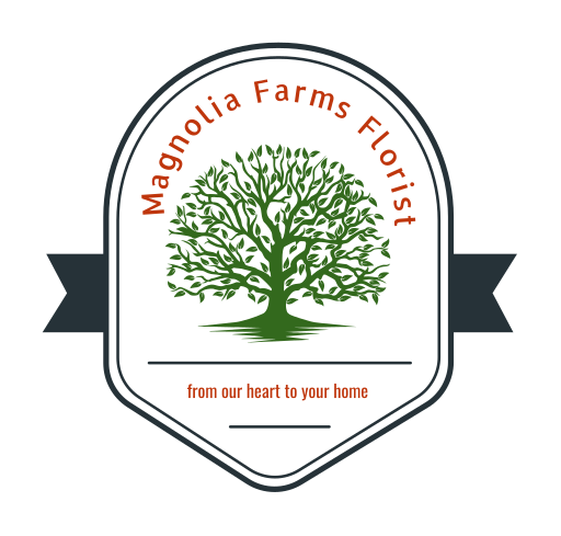
Emblem Logo via Magnolia Farms Florist
Emblem floral logos contain font and or imagery inside a symbol or an icon. Emblem logos are more traditional looking for those who want to portray a traditional brand. Emblem logos can become very ornate, remember to keep it simple as you want to use your logo on different materials for marketing.
4. Lettermark floral Logo
![]()
Lettermark Logo via Main Street Florist
A lettermark floral logo is all about being simple. Lettermark logos are typically are an abbreviation of a brand’s name or its initials to allow customers to easily remember the brand. Lettermark logos are very popular with company brands that have long names.
6. Abstract Floral Logo
Abstract Logo via Fine Flowers of Round Rock
Space
Abstract logos incorporate an abstract/geometric shape instead of an actual image. Abstract floral logos are easily scalable and a great way to be creative in your branding. Abstract logos are typically designed by a graphic designer who uses color, shape, and design to create a meaningful logo for your business.
Let Your Floral Logo Reveal Your Brand Personality
Font and color alone can convey your brand’s personality. If your brand is fun and playful or serious and sophisticated, choosing the appropriate typography and colors to reflect that is necessary.
Did you know that different colors can portray a different mood or feeling to a consumer? Here are some color palettes to help with designing your logo. Keep in mind the feeling you want to portray is important to best represent your brand’s personality.
Monochromatic
Monochromatic uses various shades of the same color to showcase a polished and minimalist look for your brand. Using Monochromatic can be a bit difficult as there is no other contrasting color to make your logo and brand pop.
Corresponding
Corresponding colors that appear next to each other on the color wheel are used in a corresponding color palette.
Complementary
Colors that appear opposite from each other on the color wheel are considered complementary. These colors are great for giving your logo a more dramatic look and feel. Complementary colors are more visually stimulating to consumers compares to the others.
Triadic
Good things come in three right? With Triadic the colors that are spaced evenly around the color wheel are the triadic colors. This color palette can be a bit difficult as you may need to use different tones and shades. Always let one color be the main color and the other two as accents.
However you choose to use color, it can be a very effective tool to convey the personality of your brand. An ineffective color scheme can ruin even the greatest of logo designs, so ensure as much thought goes into the color as the design to stand out from your competition.

Your Floral Logo vs Your Competition
What makes your business different from your competitors? Find a way to incorporate this in your logo in a unique and meaningful way. Anything too busy or distracting will not create a lasting image in your customer’s mind, so keep in mind that less is more. Standing out from your competitors is important for everyone. In business, anything that keeps you ahead of your competitors is vital, so don’t neglect your logo as a marketing tool.
Every business has unique elements to it, whether it’s your people, culture, unique products, prices, quality, etc. Find out what it is that sets you apart from the rest and incorporate this into your logo. No matter what design you land on, it is important to keep your logo clean and well-thought-out, as a sloppy-looking logo could plant doubt into a customer’s mind about the reliability of your floral brand.
Communicating Customer Loyalty and Trust
Some of the biggest brands in the world have excelled at building a loyal customer base.
Having an easily recognizable logo is very important for any business. Your business logo will be seen anywhere from internet searches to social media to business cards and signs. The goal is to have a logo easily recognizable so that a consumer can instantly relate it back to your brand.
A logo that has a strong relationship with representing what a brand has to offer will cling to a consumer’s mind. Repeat and loyal customers are an aim for any business and should be for yours as well in the competitive floral industry.

Your Logo Should Leave a Lasting Impression
Leaving a lasting impression should be your goal when designing a brand logo for your floral business. When somebody hears the name of your business, the goal is to allow them to visualize something in their head about your business.
To illustrate, the logo is the jelly to the business while the name’s the peanut butter. The two go hand in hand and work together to push your brand’s reach to the world.
Take the time to create a floral logo that will get you recognized, build a loyal brand, and separate yourself from everybody else!
____________

Thank you for reading the Floranext florist blog. We are committed to bringing flower shops the best information and tips to run their floral business. Click here to learn more about our florist software and how you can upgrade your florist website or floral point of sale.