When you are looking for information on the web, what do you use to search on?
If you are like 58% of American Adults, chances are you are checking the information out on your smartphone. Or you could be part of the 42% who find information from their tablet.

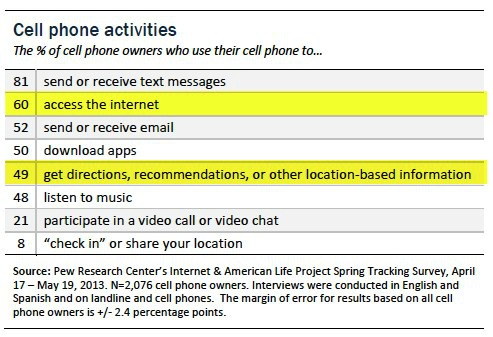
Smartphones and tablets have become a big part of our lives. Many people cannot go anywhere without their mobile devices. According to Pew Institute Research, 34% of cell internet users go online mostly using their phones, and do not use some other device such as a desktop or laptop computer.
A recent report of the % of cell phone owners who use their cell phone find …

With the trend going to more and more mobile usage, having a website that works on these devices is critical.
What can you do for your Florist Website?
Take a good look at your present site on a smartphone and see how it does when answering these questions…
- Does it load fast? If the site takes too long to download, people will move on. 74% of consumers expect a web page to load in 5 seconds or less.
- Is the content easy to read? Lots of photos and writing can look great on a desktop but look jumbled and messy on a small 4” screen. Keep It Simple & Clean!
- Is the content worthwhile? Content needs to be simple, short, focused, and fit within the screen width. Place important content toward the top of the page.
- Can people find what they want in a few clicks? Customers will not hunt long for the information they are looking for.
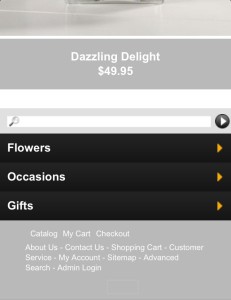
 The above photo shows the bottom half of the home page of Bill O’Shea’s Florist & Gifts mobile website. Here you can see a clear path to possible selections the customer might be looking for. When you click on the occasions button, you get to that page in just one-click. Easy and Quick!
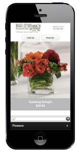
 - Is it easy to find your call-to-action buttons? When people look for your site on a smartphone they are usually looking for one of two things – how to call you or how to find directions to you. Make these buttons easy to find on every web page. Bill O’Shea’s Florist has two large call-to-action buttons on every page and make it easy for their customers to call or find directions to the store.

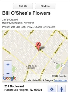
- Is it easy to find you with your directions? Make it easy for your customers to find your store on their smart phone with good directions.

- Is there plenty of space between links? Large fingers, small screen with lots of links together makes for a frustrating experience.
- Does your site fit into the screen size? Only vertical scrolling, please. Too wide with horizontal scrolling can be so aggravating!
- Can you check out fast on your site? If it takes a long time to check out and includes lot of typing and filling out forms, forget about it!
The Most Important Question you will have to ask about your Florist Website is…
- Is it a site you would visit? Okay, be honest or ask others who will be honest, would you visit your site on a smart phone or tablet? If not, you have some work to do.
Looking to Go Mobile?
Our Floranext website packages include a ‘Mobile Theme’ to optimize the floral website when viewed on a mobile device – no extra setup needed!


I want my site Mobil friendly
Excelent ideea and usefull, thanx!