An easy way to get the most out of your eCommerce sales.
No question that in this day and age every florist who offers everyday retail must have an eCommerce (commercial transactions conducted electronically on the Internet) website.
In this blog, let’s talk about floral websites best practices, ways of improving SEO (search engine optimization), content, user friendliness, and some other vital information on maximizing your eCommerce website.

image via pexels.com
Domain Name
If you already have a domain name that has been on the internet or continues to be, please DO NOT change it! Domain names carry valuable SEO, so changing your domain name will have you starting from scratch in building up your SEO.
For those of you who do not yet have a domain name here are important tips on selecting the right domain.
- Use proper keywords in your domain, if you are a flower business, then without a doubt, you must use a keyword specific to your business. For example, flowers, floral, and florist.
- Once you have picked your domain name (flowershop.com) please make sure this is a vital domain name which was never linked to any unpromising business practices in the past. You may check this on domainhistory.net.

Floral Website Appearance
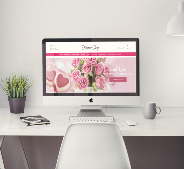
We understand the sensitivity of this topic, however, it is a very important to go over your florist website appearance. Regardless if your SEO is top ranking, if your floral website is not appealing to a multitude of customers you will lose valuable sales.
- Design: Be very careful when selecting colors and backgrounds, especially trendy backgrounds with patterns. These can turn off potential customers from shopping on your eCommerce.
- Products: Pay special attention to your product images, they should all look consistent, not overly large, or mismatched.
- Logo: Your logo should be big enough to read but not so big it takes half your home page. A clean simple logo always works best than a specific style that may not be appealing to a large demographic of visitors.
Best Practices for Floral Website Appearance
- Neutral background – (white or black) Check out some other eCommerce websites and you will see a trend in white backgrounds with some black. These companies can spend millions on the appearance of their eCommerce websites and still choose to keep it simple with a neutral background.
- Fonts – All fonts should all be consistent and not overly mismatched. Fonts should also be large enough to read and understand.
- Mobile Friendly website – A responsive website will allow customers who are on any other devices (tablet, iPad or mobile) a better shopping experience. Besides this very important reason, Google search engines as of April 2015, is using websites who are mobile friendly as a ranking signal.
- Specific florist content – Having lots of specific content on your website allows for more keywords. Keywords are high for indexing and ranking your florist website by increasing your SEO. Write a hefty “About Us” and wording for each page.
- Contact information – Your address should be clear and visible on the homepage, we like to see it listed on top (header) of the home page and also below (footer). You should still have a “Contact Us ” page with your address, business phone number, map, and email options.
- No rotating images or videos on your homepage – Reframe from using quick rotating banners, images or videos on your home page. This can be really confusing to your shopper and actually altogether make them click out of your floral website. While researching floral eCommerce, we found out that the websites who had no moving images, banners or videos on the home page had a tremendously better bounce rate and higher sales.

Floral Website Content, SEO & Tags
If you are working with a floral website hosting company then most of these important functions should be already implemented on your eCommerce website. In the chance that they are not, we want you to be super informed on these floral websites must haves for SEO.
- Add-Ons & Upgrades: All products should offer customers upgrading options and add-ons. Adding these two simple elements to your floral website can have a huge impact on your profits.
- Header Tags: Headers tags (H1 ) highest level of tags are valuable in SEO, as it sums up what your website is about. Writing a correct H1 tag is essential and should be done by your website provider. H1 tags greatly improve your search engine rankings.
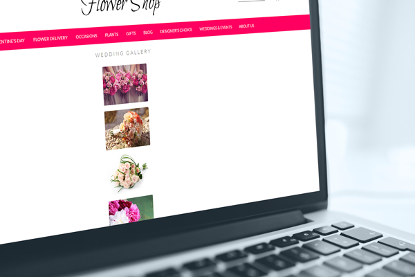
- Wedding /Event Gallery: If you do wedding and event flowers, it is a great idea to showcase your beautiful work in an image gallery on your website. These are very successful with customers, spending loads of time admiring your selections, which also increases your SEO.
- Make sure customers can clearly see an option to contact you for a consolation.
- Write a short bio on your Wedding/Event flowers page. It is perfectly OK to be conceded.(be sure to include specific keywords such as wedding, event, locations and so on)
- Website Footer: Your floral website footer is very important! The footer contains loads of information and valuable keywords which rank really well for your overall SEO. Make sure your floral eCommerce has a footer with a clear title descriptions and locations where services are provided. Below are footer website must haves.
- Terms of Service, Privacy Policy
- Site Map
- Contact Us
- Business Address
- Local Pages
- Local Pages: Offering great placement for SEO, local pages allows you to add multiple locations and businesses you provide services to on a designated page on your website. Rather than just placing high for your location, you may add various locations to also rank for those areas. You can also add hospitals, funeral homes, venues, schools, and many more to rank for these business keywords.

Floral Website Marketing
There are countless ways of marketing for your florist website, below we will explore some options that have proven successful getting customers to purchase on your eCommerce site.
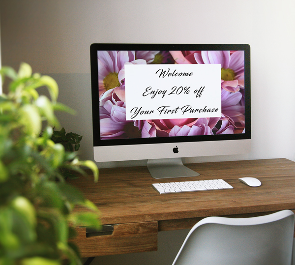
- Offer Promotions & Coupons: Shoppers love deals, offer coupon codes periodically on your floral website for percentages off a total shopping cart. Set an amount that customers must spend in order to get the percentage off, free delivery is also a great selling option. Promotions are great to offer on specific items, for instances a percentage off on roses.
- Give It For Free: If you are new to the eCommerce website a great way to have customers buzzing about your floral website is to offer something for Free. We understand you cannot give it all for free, how about a raffle or the first customers who email you from your website can get a free arrangement.
- This keeps customers clicking on your website, building your SEO.
- You can post the winner on your social media, which creates conversations and likes, which also increases your visibility.
These are some easy ways to get the most out of your eCommerce site. Florists, let’s hear your feedback! Do you have any important website design functions that have been successful? Please share all your feedback, tips or any floral website related questions you would like addressed below.
________________________
Floranext makes great florist software. Florist websites, floral POS, florist wedding/event proposal software, and florist technology. Let us know if you want a free demo or try our software for free here.


we wanted to make a flower e com website , do u have any expertise in developing and SEO
I would love to share my points here. Actually what we do in our company is, whenever we receive a new project we find it’s competitors and then we check the on page of all competitors. Checking the on page strategy of competitor’s websites is really very helpful to know what keywords they are focusing. We can also use those keywords and do much better from our competitors and we do that.